In computing, an avatar (also known as a profile picture or userpic) is
a graphical representation of a user or the user's character or persona.
Alert
Alerts are available for any length of text, as well as an optional
close button.
A primary alert
example!!!
A success alert
example!!!!
A danger alert
example!!!!
A alert alert
example!!!!
Badges
Badges are used to highlight an item's status for quick
recognition.Badges scale to match the size of the immediate parent
element by using relative font sizing and rem units.
Badge with Icons
To show cart or notification count, you can use number badge. Check code
below to copy the html part as is.
Badge with avatar
Badges can be integrated with Avatars by showing colors to show the
online status of user.
Button
Buttons are also called as call to action. We have range of buttons and
their states. You may use a tag or button element, you need to add
respective classes, and you are good to go.
Primary Button
Whenever you want your user to click on a link or button, use primary
style buttons.
Link Button
Whenever you want your user to click on a link , use link style buttons.
Lorem ipsum dolor sit amet consectetur adipisicing elit. Beatae
accusamus, fugit sunt vero voluptatibus quae tempora necessitatibus
possimus quisquam aperiam!
Vertical/Horizontal cards
Badges can be integrated with Avatars by showing colors to show the online status of user.
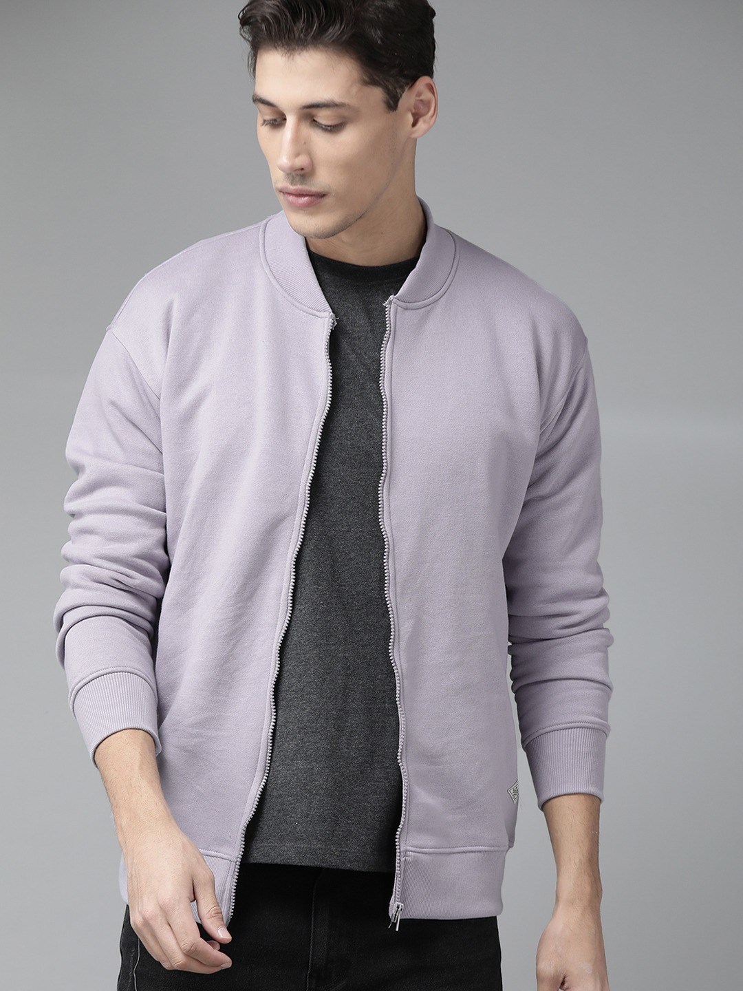
Men Premium Jacket
$2000
Cards with shadow
Badges can be integrated with Avatars by showing colors to show the online status of user.
Men Premium Jacket
$2000
Images
Images can be responsive to fit the parent's width, and also can be customised to be round shaped
Responsive Images
You can add class img-fluid to make your image fit the width of container. It's height will get adjusted by keeping the aspect ratio same. If you want to change the aspect ratio, you will have to crop the image.
Rounded Images
You can add class img-round to make your image round shaped.
Typography
Check out below text utilities.For heading u can use h1, h2, h3, h4, h5, h6 elements. The same font-styling is present for class names h1, h2, h3, h4, h5, h6 class.
You can add one of these classes to style the text.
H1 - This is a Heading
H2 - This is a Heading
H3 - This is a Heading
H4 - This is a Heading
H5 - This is a Heading
H6 - This is a Heading
P - This is a small text
This is gray colored text
This is center text
Input
There are Input fields listed below and Input validation is also styled.
Text Box
Input with validation and errors style
1. Required field (Display error if Submitted blank)
2. Input with different error styles
Navigation
Navigation bar is used to navigate through the web apps or websites. This navigation component is responsive.
It is a hamburger menu in medium and small devices.
Rating
Rating components can be used as read-only badge or in reviews section. Can be used in reviews section as form too.